BOSS Revolution Money Transfer: Making Sending Money Home Feel Familiar
Role: UX Researcher · Research Lead
Timeline: 8 weeks
Team: Product · Design · Engineering · Compliance · Marketing
Research: 12 customer interviews · Journey mapping · Survey (n≈500) · Prototype validation
Scope: U.S.-based customers sending money internationally
Overview
At IDT Corporation, I led mixed-method research to rethink the BOSS Revolution money-transfer experience.
The challenge was not simply to shorten a complicated financial flow. Customers brought different cultural, language, and financial expectations, while compliance and banking requirements meant some complexity could not be removed. I reframed the problem around a more useful question: Which complexity was necessary, and which were we making customers carry unnecessarily?
Research surfaced two priorities for the redesign: make unfamiliar financial actions easier to understand and reduce repeated effort for returning senders. I worked with Product, Design, Engineering, Compliance, and Marketing to translate those findings into the experience.
The redesign was associated with an 18% increase in monthly transactions.
The Problem
The BOSS Revolution money-transfer experience had evolved across multiple screens and services, but the team lacked a shared, research-backed view of where customers experienced the most meaningful friction.
Before Product and Design invested in the redesign, I needed to understand:
where customers were repeating unnecessary work or losing confidence
which icons, labels, and financial conventions created confusion across cultural and language backgrounds
where personalization could make repeat transfers easier
how adjacent services such as mobile top-up should fit without distracting from the core transfer journey
Because this was a regulated financial product, not every step could simply be removed.
That shifted the research question from “How do we make this shorter?” to: Which complexity was necessary and which complexity were we making customers carry unnecessarily?
What I Needed to Learn
I did not want to come back with a long list of usability issues. I needed to identify the problems that were most important for the redesign.
I focused the research on four questions:
Friction
Where were customers repeating work, losing time, or hesitating, and which of those problems could the product actually remove?
Cross-cultural clarity
Which icons, labels, and financial conventions were creating uncertainty across different cultural and language backgrounds?
Relationship memory
What information were repeat customers providing again and again that the product could remember or surface at the right moment?
Journey priorities
How should money transfer and adjacent needs such as mobile top-up fit together without competing for attention?
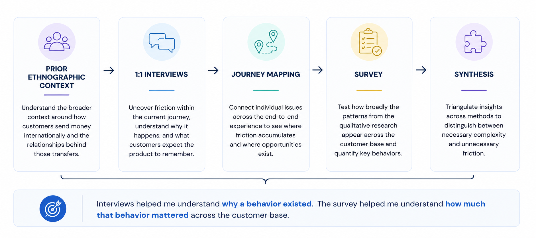
Why I Used a Multi-Method Approach
No single method could answer the questions we had.
I started with customer interviews to understand how people thought about sending money, what they expected from the experience, and where uncertainty or repetition showed up.
I used those conversations to map the end-to-end journey and identify the moments that needed deeper validation.
From there, I designed a survey to test how broadly those patterns appeared across a larger group of customers and help the team prioritize which problems were worth solving first.
The sequence was intentional: understand the behavior first, map where it mattered, then validate which patterns were large enough to influence the redesign.
Challenges & Constraints
The research plan had to work within three realities of the product and organization.
Recruiting without a dedicated research panel
I partnered with Marketing to recruit existing BOSS Revolution customers and intentionally included different sending patterns, customer backgrounds, and international transfer corridors. This gave me access to people with real, recurring money-transfer relationships rather than relying on a general research panel.
Designing for different cultural expectations
Customers brought different language, cultural, and financial expectations into the same experience. I treated that variation as part of the research design, looking for where icons, terminology, or financial conventions worked for some customers but created uncertainty for others.
Working within financial and compliance requirements
I worked with Product and Compliance to separate requirements we could not change from friction we could. That kept the recommendations focused on improvements the team could realistically act on.
These constraints shaped both the research and how I prioritized recommendations. A useful finding had to improve the customer experience and still be practical within the realities of an international money-transfer product.
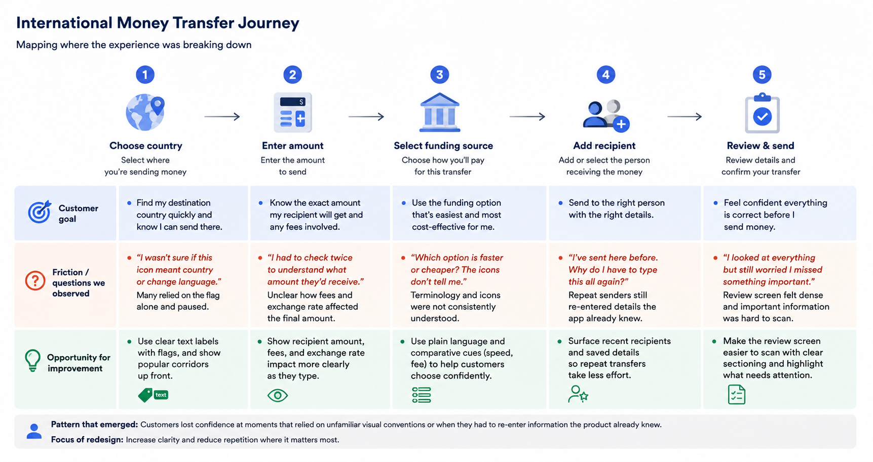
Mapping Where the Experience Was Breaking Down
I synthesized the research around the actual transfer journey rather than treating each usability issue as an isolated screen problem.
Choose country → Enter amount → Select funding source → Add recipient → Review & send
Across that flow, I mapped where customers hesitated, repeated information, or needed more confidence before moving forward.
Two patterns became especially important: some visual conventions were not equally clear across different customer backgrounds, and repeat senders were repeatedly entering information the product could already help them recall.
The journey gave Product and Design a shared view of where friction was accumulating and helped focus the redesign on the moments with the clearest opportunity.
What the Research Changed
I worked with Product and Design to turn the findings into a small set of priorities for the redesign.
Make critical actions easier to understand
Important steps relied less on iconography alone, with clearer labels and supporting cues where customers needed more confidence.
Make repeat transfers feel familiar
Recipient history and relevant previous choices were surfaced more clearly so returning customers did not have to rebuild the same transfer from scratch.
Keep the core task focused
Adjacent services such as mobile top-up were positioned so they could support the broader experience without competing with the primary money-transfer journey.
Prioritize what could realistically ship
Recommendations were reviewed against compliance, technical, and product constraints so the team could focus first on changes with both customer value and implementation feasibility.
Impact
The redesign was associated with an 18% increase in monthly transactions.
The research also had an impact beyond the redesign. The journey map and findings became a shared reference point for Product and Design, and research began entering design conversations earlier rather than being treated mainly as a validation step at the end.
For me, that was an important outcome of the project: the work did not end with a research readout. It became part of how the team made product decisions.
Takeaway
This project reinforced that reducing friction does not always mean removing steps.
Sometimes the better experience comes from making a necessary decision easier to understand. Other times, it comes from recognizing that the customer has already made that decision before and helping them move through it faster.
The research helped us distinguish between the two.
Make the unfamiliar clearer. Remember what is already familiar.
FINDING 01
One Interface, Many Cultural Expectations
Across interviews, I saw customers pause at actions that relied heavily on icons or familiar financial conventions. The same visual cue could feel obvious to one person and require interpretation from another.
Most could eventually move forward, but the hesitation mattered. In a money-transfer experience, customers need to feel confident that they understand what will happen before they tap.
Looking across participants, I realized this was not primarily a visual-design problem. It was a comprehension problem.
That changed the design question from:
“Is this icon familiar?”
to:
“Can customers understand this action quickly and confidently, regardless of the conventions they are used to?”
What changed
For important actions, the redesign relied less on iconography alone and used clearer labels and supporting visual cues to make the intended action easier to understand.
A shared interface did not guarantee a shared understanding.
FINDING 02
Repeat Senders Shouldn’t Have to Start Over
A pattern came up repeatedly in the interviews: many customers were sending money to the same family members, in the same countries, using choices they had made before.
But the experience still asked repeat senders to make parts of those decisions again.
That shifted how I thought about personalization. Customers were not asking for more personalized content. They wanted the product to remember the relationship and information it already knew, so familiar transfers required less effort.
The follow-up survey reinforced that repeat sending was common enough to treat this as a product opportunity, not just an individual preference.
The opportunity was not:
“Show me something personalized.”
It was:
“Don’t make me tell you something you already know.”
What changed
The redesign gave more weight to recipient history, relevant previous choices, and contextual suggestions, making repeat transfers faster without adding more complexity to the experience.
The best personalization reduced repetition rather than adding decoration.